Blast to the Future!
Pratt Fine Art Center's 36th Annual Art Auction
Challenge
This project's purpose was to create a playful theme, with a consistent aesthetic and branding, for Pratt Fine Art Center's 36th Annual Art Auction. The theme for the 2018 event was "Blast to the Future". The visuals were based on the invitation which a Pratt faculty member designed, which had a funky, retro-space aesthetic. The goal of this project was to use the initial visual style from Pratt faculty member as a starting point to develop a full visual identity.
My Role: sub-contracted by Dandy Co. to design the visual brand and key elements for the event.
Imagery and Style
quirky space age
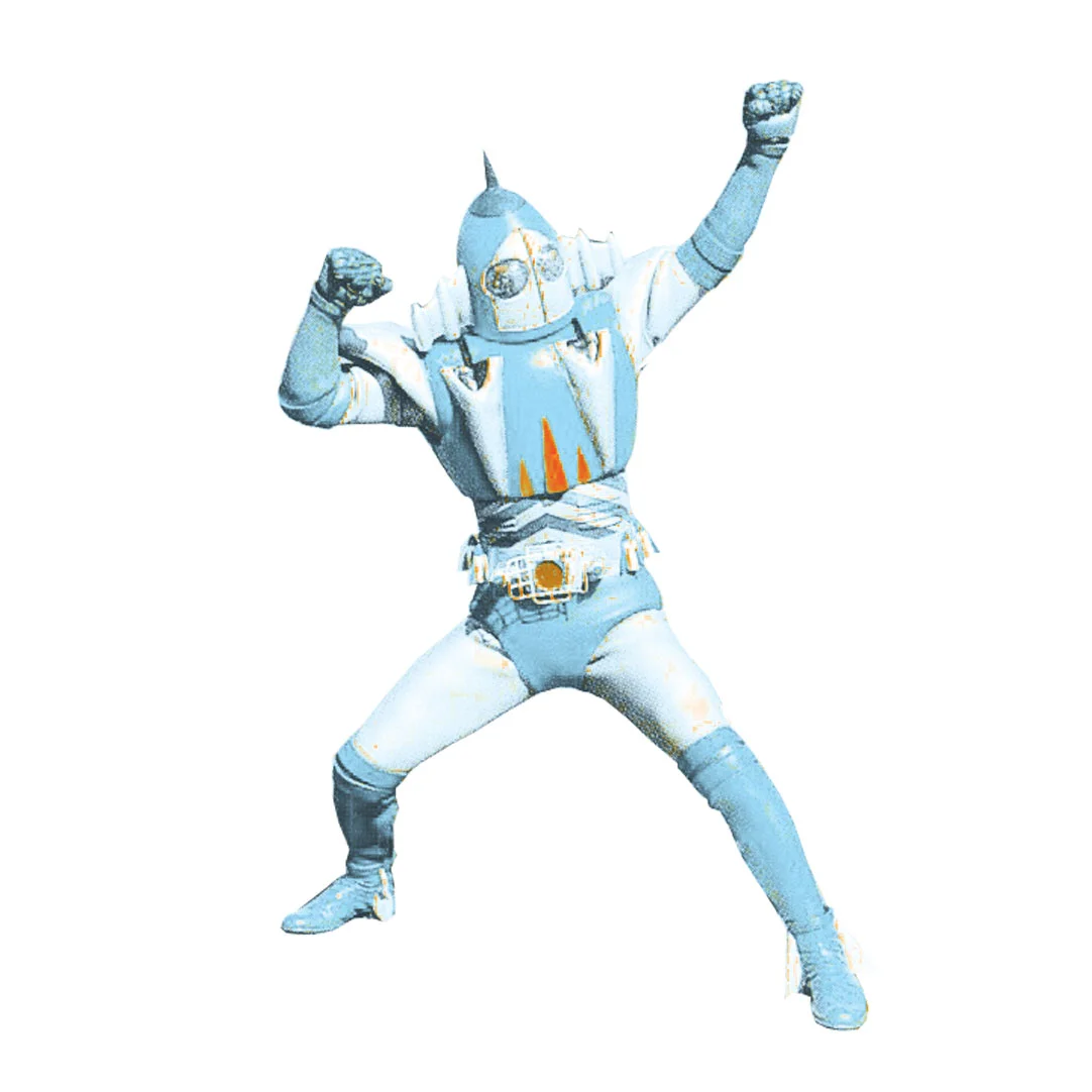
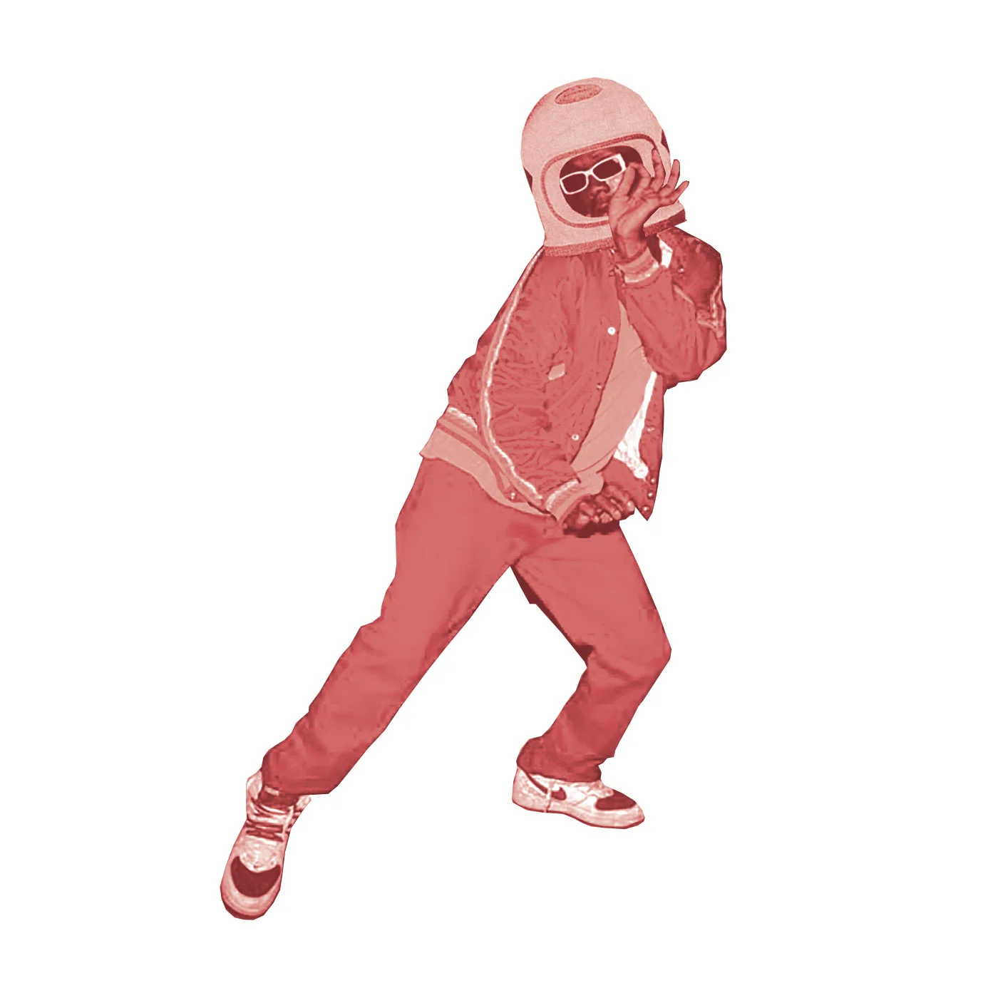
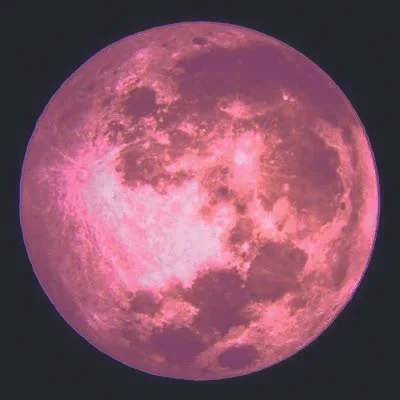
Below are the key elements for “Blast to the Future!”, which were chosen to create a whimsical, quirky tone for the event. As a true 90’s kid, the inspiration for the use of quirky characters, color-burn overlays, and the color palette came from 1999’s Zenon: Girl of the 21st Century, a movie from my childhood that succeeds in blending a 1960’s retro and futuristic feel into one.
Catalog Cover and Divider Pages
Designing the catalog and divider pages would ultimately determine the style and visual brand of the auction. My contractor at Dandy Co. and I knew that once the catalog was designed, it would be easy to extend the visuals to the other assets. The design of these pages come from a heart of play, and they tell a story of a space adventurer blasting off to discover something new.
Supplementary Assets
Buttons | Table Numbers
These were fun little assets to create, as they posed the challenge to put a lot of information in a small and circular living space. The "Donating Artist" button was given to the artists who contributed to the auction, while the "Thank You!" buttons were given to those who purchase artwork. For the table numbers, the bottom 1.5" had to remain blank; any imagery or text that was in the bottom 1/3 would be cut off by the holder.
banners
These banners hung in the appropriate sections of the venue where the three different events will be held. The largest challenge was finding a design element for the "Live Auction" banner that would balance the composition and demand the same attention the "1" and "2" do on the other banners.
photo backgrounds
These three images will be hung as 7.5 tall x 8 wide photo backgrounds at the auction. Through out this process, I would give my contractor (Dandy Co.) 3 options of designs: Simple, Whimsical, and one in between the two.
Signage
These signs are 20"x30" and will be used as wayfinding within the venue. With these designs, the display type took the highest priority. Because Dandy Co. and I had worked on corporate conference signs like before, they were quickly completed and submitted for approval. The challenge for this part of the overall project was to ensure the communication was crystal clear, while ensuring the layout was filled completely without the additional design elements adding clutter.


